
Revamping Canvaz’s Online Presence
Canvaz is a residential and commercial interior & renovation company, specializing in crafting custom cabinetry, millwork, and interior finishes.
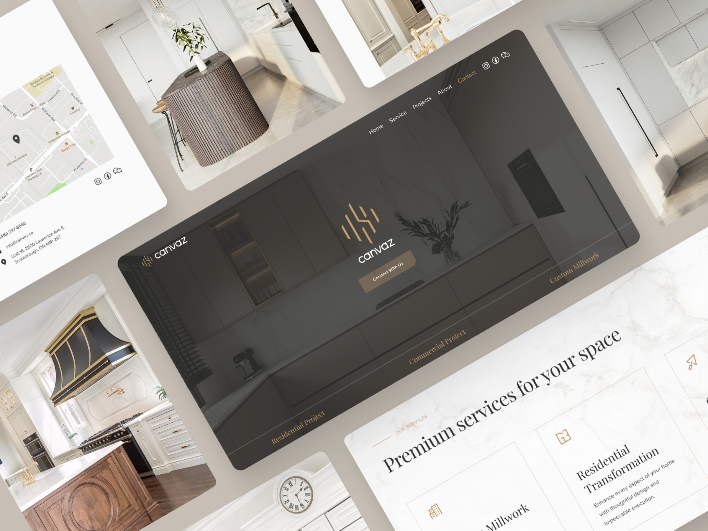
My task is to transform the interior renovation company's website into a modern, user-centric platform that instills credibility, enhances usability, and drives engagement.
Role
User Research
Web Design
Client
Canvaz
Canvaz.ca
Duration
2 Weeks
Tool
Figma
Adobe Photoshop

CHALLENGE
How might we reimagine the website to both showcase Canvaz's exceptional craftsmanship and provide a seamless user experience?
PROBLEM ANALYSIS
Disorganized UI Elements
A disorganized interface not only complicates users' information retrieval process, but also undermines the website's credibility and trustworthiness. These are crucial factors for an interior renovation company aiming to showcase its modern and innovative approach.
5 Font Styles & 8 Sizes
Irrelevant Features
Including unnecessary features such as a ‘service‘ on main navigation that doesn’t work and 'login,' which serves no purpose for the website's intended function, clutter the interface. Additionally, elements like 'Powered by Juicer' and 'QR Code' draw unnecessary attention and disrupt the cohesive look and feel of the website.


SOLUTION
Clear Visual Hierarchy
Setting a visual hierarchy enhances consistency
in branding elements such as colors, typography, and imagery. This helps reinforce the company's identity and creates a cohesive user experience.
Minimalist Approach
Conducting a thorough review of all website features helps determine their relevance and utility. This practice allows for the elimination of clutter, focusing instead on essential elements and embracing a modern, minimalist design philosophy for the company.
STYLE GUIDE
Color Palette

Warm taupe primary color exudes a refined charm, reflecting the company's commitment to quality expertise and craftsmanship.
The light gray background offers a clean and modern aesthetic, providing a fresh canvas for content to shine.
Dark charcoal gray for text ensures readability and adds a touch of sleek professionalism, enhancing the overall user experience.
Typography
Playfair Display & Proxima Nova features clean lines and modern letterforms, making it a suitable match for the sleek and sophisticated aesthetic of the color palette.


DELIVER


REFLECTION
Through this experience, I enjoyed weaving together professionalism and artistry, akin to the craftsmanship I've honed over the years. Furthermore, I was reminded of the critical balance between aesthetics and functionality that transcends industries. It's a testament to the essential role a website holds in presenting a company's portfolio, and elevating its essence to potential clients.